|
|
||
|
|
|
|
| Index | The meaning of the British Royal Arms | Change in the Royal Arms in 1837 | English potters use of the Arms | American potters - Royal Arms to National Symbols | English potters use of 'American' Symbols |
|
English Potters incorporating American Symbols in their marks “This is fine British ware, made specifically for you” |
Use of American and British symbols
English potters of the 19th century frequently incorporated a blend of British and American symbols into their marks, reflecting both tradition and commercial strategy. The lion and unicorn—long-established elements of the Royal Arms—signalled heritage, authority, and the perceived quality of British manufacture.Key Symbols & Marketing Strategy -
To appeal directly to export markets, particularly in the United States, potters often combined these familiar British motifs with elements suggestive of American identity. Shields bearing stars, stripes, or vertical bars—reminiscent of the Great Seal—created a visual language that resonated with American consumers. The effect was deliberate: to present wares that were unmistakably British in origin, yet tailored to American taste and sentiment.
Historical Context -
In the mid-to-late 19th century, the Staffordshire Potteries faced growing competition from an expanding American ceramics industry. In response, manufacturers adopted increasingly sophisticated marketing devices.
The use of dual-national imagery can be seen as a subtle but effective strategy—conveying both the prestige of British craftsmanship and a sense of affinity with the American market. In essence, these marks communicated a simple message: this was quality British ware, produced with the American consumer in mind.
Using these dual-nationalistic symbols was a clever marketing tactic—essentially telling the buyer, “This is fine British ware, made specifically for you”
|
|
|
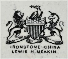
operated at Cannon Street 1851-1852 |
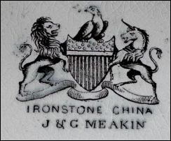
 Ironstone China J & G Meakin operated at Cannon Street 1852-55 |
|
This specific mark was a strategic marketing tool designed for the American export market from the mid 19th century.
|
|
|
|
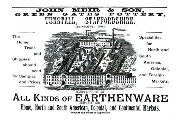
John Meir & Son
Operated at
Tunstall from 1837 to 1897 - John Meir & Son
»
|
undated advert - c.1875-1885 (most likely) for John Meir & Son The wording “Home, North and South American, Colonial and Continental Markets” together with “Shippers should send for samples and prices” reflects a well-established global trade network, not an emerging one. |
|
John Meir & Son used a wide range of backstamps on their ware - these four selected marks trace a clear shift in emphasis from British identity to targeted export marketing.
Together, these marks show a progression from established British symbolism to deliberate American appeal—reflecting the increasing importance of the U.S. market and the need to align British-made wares with American identity. |
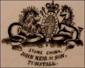 Stone China John Meir & Son Tunstall |
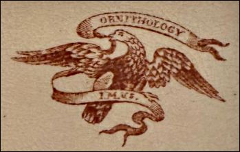 I. M. & S. |
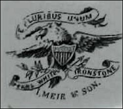 E Pluribus Unum Pearl White Ironstone I. Meir & Son |
 Ironstone John Meir & Son England |
|
This early mark combines the Royal Arms with the town name “Tunstall.” |
The introduction of an eagle holding a ribbon marks a clear stylistic shift. |
Targeted American appeal - this mark adopts full iconography of the United States Great Seal. |
Where “ENGLAND” appears beneath the Royal Arms in a more formalised, standardised way, it is certainly post-1891 period following U.S. import labelling requirements. This represents not a new marketing direction, but a regulatory consolidation of an already established export practice. |
|
|